- Information is ambiguity, contraints reduces information
- Information is the number of alternatives and thir probability of occurences
- Uncertainity is potential information
- Uncertainity is extremely important for good communication
- Whole communication is about managing uncertainity
- More choices means more uncertainity means more information
- Measurement of uncertainity is measurement of information
- Uncertainity has the capacity to hold you during any presentation
- Information theory defies common sense understanding of the term information
- Outcome that can be predicted accuratey does not carry information e.g. Air Traffic Control signals for a pilot
Sunday, February 25, 2007
Information Theory by Shannon
Few points discussed in the class of Information theory
Holi is nearing
So one of the most colourful festivals of India is nearing. And so my blog is also making up to match the mood of it. Look at the header.
(Ohh it still shows those hearts. Well then clear your browser cache.
If you are using Firefox, click on Tools->options
then open privacy tab and hit "clear now" button.
If using Internet Explorer click tools->Internet options
click "delete" in browsing history and clear all data.)
(Ohh it still shows those hearts. Well then clear your browser cache.
If you are using Firefox, click on Tools->options
then open privacy tab and hit "clear now" button.
If using Internet Explorer click tools->Internet options
click "delete" in browsing history and clear all data.)
Saturday, February 24, 2007
Claude Garamond
It's all typography on my mind, desk, laptop and assignments these days.
Understanding Indian typefaces is really a challenging job especially when you need to deal with 26 different languages and each language having it's own typefaces.
Have you ever seen "Malyalam" font.
I'll show and you'll be baffled as to how it can be designed. With more than 5 levels of ascenders and descenders it gets quite complex to handle.

Well the topic however reads something different. As a part of course we are supposed to study the life and works of one of the typographers. So we have Claude Garamond on our list.

The beauty of Garamond font is it's consitency and lucidity.
However there are many contradictions going in history as to who is original compiler of this types. Garamond fonts were modeled after the handwriting of Angelos Vergetiosrom. And later after his death the punches and matrices of the types were acquired by Christoph Plantin from Antwerp, the Le Bé type foundry and the Frankfurt foundry Egenolff-Bermer and given new looks.
Contemporary Garamond examples can be found in Adobe Garamond and ITC Garamond.
Apple chose Garamond as it's official font for mac OS, French government chose the same fonts for all documentation. The typeface used in the hardcover editions of the Harry Potter books is Adobe Garamond.
Information Source: http://en.wikipedia.org/wiki/Garamond, http://www.linotype.com/414/aboutthedesigner.html
Hitch - latest movie
Well I do get time to watch movie some time. I usually don't watch them often, but today thought of.
So Hitch was the selection. Good movie. It has lot to tell about love and life. Though we may be good at heart we need basic principles to show that goodness. ;-)
"Life is not about the amount of breath you take,
it's the moments that take your breath away" - Hitch (Will Smith) in the movie.
So Hitch was the selection. Good movie. It has lot to tell about love and life. Though we may be good at heart we need basic principles to show that goodness. ;-)
"Life is not about the amount of breath you take,
it's the moments that take your breath away" - Hitch (Will Smith) in the movie.
Tuesday, February 20, 2007
Typographical attempt
As a part of typography course this semester we need to study typography of Indian scripts. As a step towards it we were asked to write our name in our own mother tongue and then make it look like Universe Bold font. And I came out with this. It's not that simple to just come out with this version. It takes lots of time and effort to minutely study different elements of a given font and them inculcate them into a new one (esp. when it is Indian).
We were also asked to try out the names by calligraphy. The scanned images will be uploaded soon.
Saturday, February 17, 2007
A new look to blog
Since morning I was trying to give a new and dynamic look to my blog. And there it is.
Just can't wait for tweaking more things with this.
Just can't wait for tweaking more things with this.
Friday, February 16, 2007
First stop animation
I was just playing with flash and my friend with camera and the stick board in our class room. And he came up with a series of images. I quickly transferred them on my comp. and to flash and voilla the result is an animation.
Watch out!!!
Watch out!!!
Thursday, February 15, 2007
Designers Equipments
Well designers first and foremost equipments are his ideas. Then comes that huge set of executing the ideas. Pen and paper being the most accessible they in the pocket of each of them. And then pen eraser colors camera sketch-pens scale markers (the list will be too long).
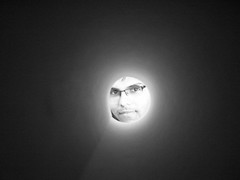
The reason I haven't taken a color photograph is to discard excess information. Well it looks classy in B/W.

The reason I haven't taken a color photograph is to discard excess information. Well it looks classy in B/W.
Tuesday, February 13, 2007
Basics of photography-1
A photograph is very good medium of communication. It communicates the directly. Though not as much as lingual means. It is very specific. As a part of curriculum I had Photo communication as one of my subject.
I'm jotting down some of the basics of camera for photography.
I used Nikon FM2 SLR camera with black and white film (with black and white it's easy to decide what is good. colorful means more information means more difficult).
There are mainly two settings to be looked at
More light means the picture will go dark (black) when developed and less light means it'll be lighter (white, see talking black and white is quite easy and direct too).
To understand the theory behind this we need to understand the chemistry part of it.
The film is layered with silver halide (a chemical), which when exposed to light form silver salts that block light or say form black portion on negative (the film after exposure). More information on this can be found at http://en.wikipedia.org/wiki/Photographic_film
There is a shutter between aperture and film which blocks the light falling on the film. When we click the camera the shutter opens momentarily let the light fall on the film and then close.
So shutter speed is the speed by which shutter opens and closes. Less the shutter speed more the shutter remains open and vice versa. So less the shutters speed more light falls on the film and darker the image. Many exciting experiments have been done by keeping low shutter speed. If you have digital camera try out fireworks mode. It has low shutter speed to capture all that sprites.
Ohhhkkk. Too much of explanation. I think only an image for this entire explanation will do.
So here it is.

More on photography to follow in later posts.
[Edit]thanks to Ami for pointing out the mistakes here. Well yes shutter speed and aperture both control the amount of light falling on the film.
I'm jotting down some of the basics of camera for photography.
I used Nikon FM2 SLR camera with black and white film (with black and white it's easy to decide what is good. colorful means more information means more difficult).
There are mainly two settings to be looked at
- aperture
- shutter speed
More light means the picture will go dark (black) when developed and less light means it'll be lighter (white, see talking black and white is quite easy and direct too).
To understand the theory behind this we need to understand the chemistry part of it.
The film is layered with silver halide (a chemical), which when exposed to light form silver salts that block light or say form black portion on negative (the film after exposure). More information on this can be found at http://en.wikipedia.org/wiki/Photographic_film
There is a shutter between aperture and film which blocks the light falling on the film. When we click the camera the shutter opens momentarily let the light fall on the film and then close.
So shutter speed is the speed by which shutter opens and closes. Less the shutter speed more the shutter remains open and vice versa. So less the shutters speed more light falls on the film and darker the image. Many exciting experiments have been done by keeping low shutter speed. If you have digital camera try out fireworks mode. It has low shutter speed to capture all that sprites.
Ohhhkkk. Too much of explanation. I think only an image for this entire explanation will do.
So here it is.

More on photography to follow in later posts.
[Edit]thanks to Ami for pointing out the mistakes here. Well yes shutter speed and aperture both control the amount of light falling on the film.
A designer chair
I came across this designer chair video and it's awesome. It's really useful for them who need to change their home every now and then and also for frequent picnic goers. Rather I would say it's meant for all. Though I haven't sat on it, it may give a little hard feeling.
The Folding Chair
The Folding Chair
Saturday, February 10, 2007

Thursday, February 08, 2007
Words of wisdom
As a part of ICOGRADA design week in India, IDC has organized 2 day International Design conference. The response from students, faculties and professionals from around the India is overwhelming. During the conference we have many eminent designers speak about their design journey and the design in their respective countries.
At the end of day one we had "Meet the GrandMasters" session in which we had open session of questions and answers.
Following are some of the words of these GrandMasters
April Greiman -- "Don't give up against client demands if they are not correct by design. Do what is correct design"
"Designer is a teacher to the client".
Prof. Mahendra Patel who is one the most respected typographer of India stole the show by giving real life examples in his typical gujju (gujarati) accent. In his own words ".. never promise high to client. But always deliver more. This excites client..."
Wednesday, February 07, 2007
IDC is happening
With the event of ICOGRADA in full bloom IDC has become a happening place. It's already like that but now it's flooded with designers from around the world and that too with gems of design. We have designers like Massimo Vignelli, Iko Avital, R K Joshi, Mahendra Patel, Halim and many more who are grandmasters in their respective areas. And budding desingers like us are having a fabulous time with them. Students from around the country have gathered to get to know the nuts and bolt of design by working under/with these grandmasters.
More things coming soon on the blog.
More things coming soon on the blog.
Subscribe to:
Posts (Atom)